The Brief
Exclusive Property Management (EPM) specialise in leasing and managing luxury homes and holiday rentals on the Mornington Peninsula. The goal was to formalise their branding elements and elevate their presence. The project required a new website to showcase their capabilities and property portfolio.
Key Stakeholders/Audiences: The visual identity and aesthetics needed to appeal to three distinct groups simultaneously:
- Prospective Renters and Owners
- Current Owners
- Current Renters


My role
My role involved developing a cohesive brand identity and executing its implementation across all digital and physical touchpoints.
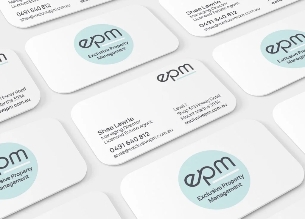
- Branding Toolkit: Developed a comprehensive branding toolkit, including a revised logo, colour palette, and typography.
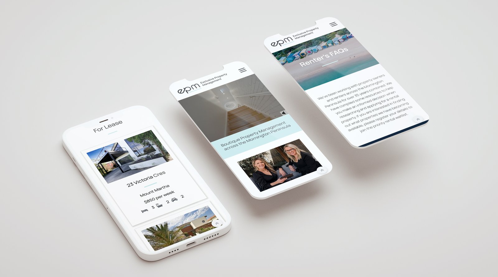
- Web Integration and Functionality: Designed and implemented the new website. Crucially, I managed the integration with the ‘Propertyme’ platform via a custom-built API to feed property listings directly to the site.
- Content Strategy: Ensured the website served the diverse audience groups by featuring dedicated FAQ sections with video learning materials, useful links, and downloadable content.
Outcomes
The project successfully delivered a formal, elevated brand identity and a fully functional digital hub for EPM.
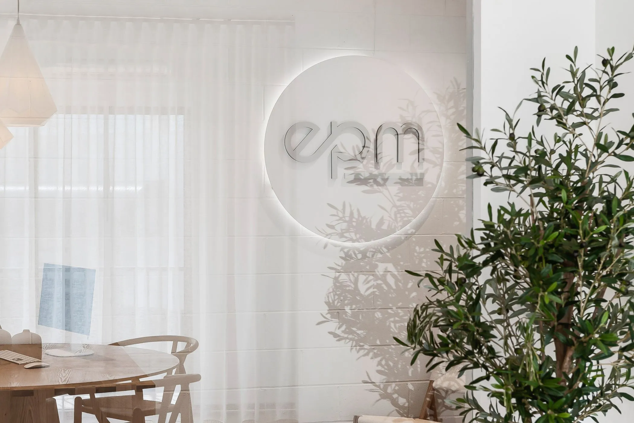
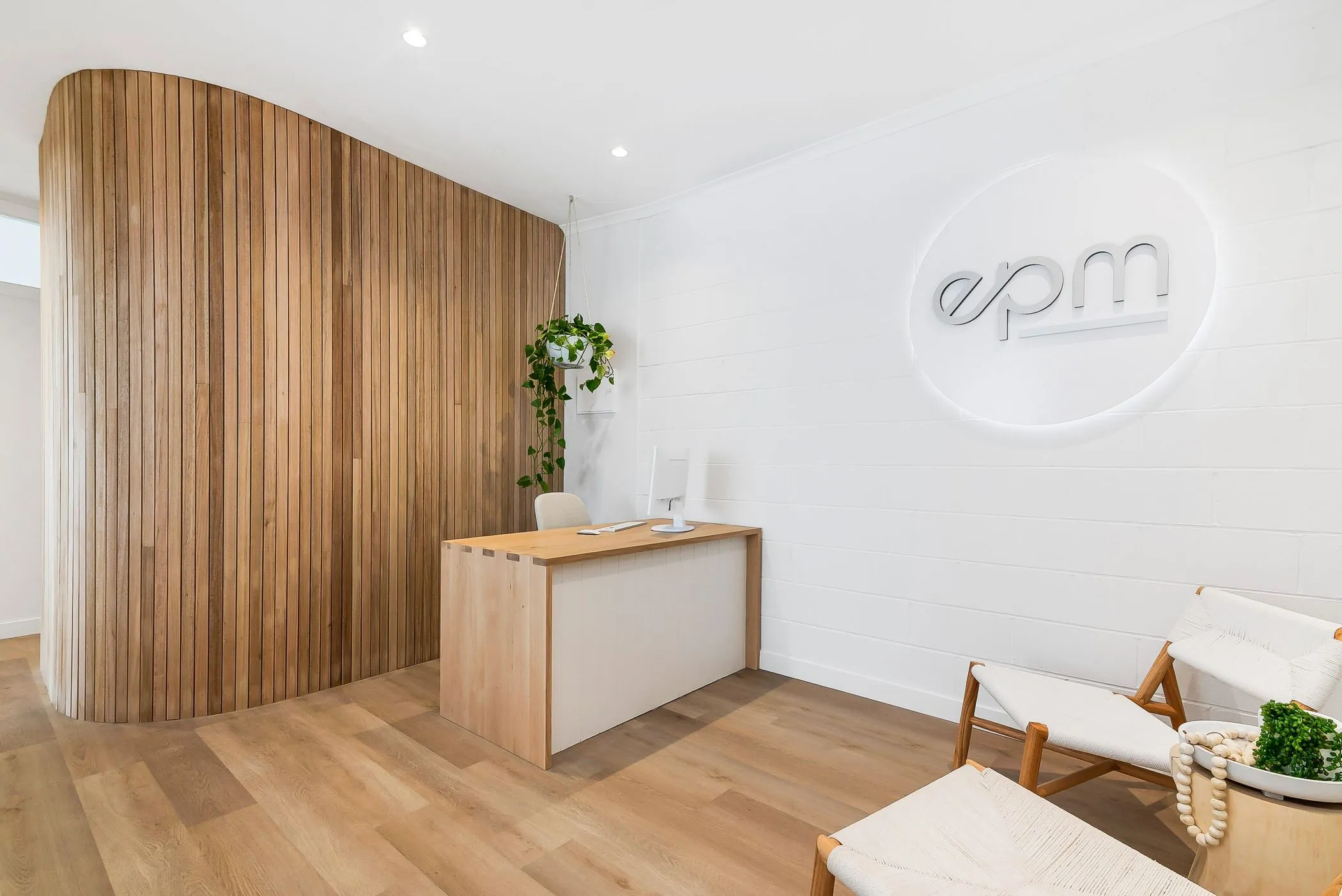
- The branding toolkit provided a consistent, professional foundation implemented across the new website, marketing collateral, digital platforms, and outdoor signage.
- The website’s design and integrated API feed provided a seamless way to showcase the property portfolio and capabilities, appealing to the target audiences.
- The inclusion of self-service resources (FAQs, video learning) streamlined communication for current clients.
Success criteria
Formalisation and successful implementation of a comprehensive branding toolkit across the entire business ecosystem, complemented by a custom API integration ensuring the property portfolio on the new website was up-to-date and seamlessly managed through the Propertyme platform.
Reflections
The initial focus on aesthetics and branding was critical, but a more in-depth Accessibility/Contrast Audit (WCAG 2.1) would be mandated earlier in the process. Proactively auditing the visual style against accessibility standards for all users would ensure maximum usability and compliance from the start.