The Brief
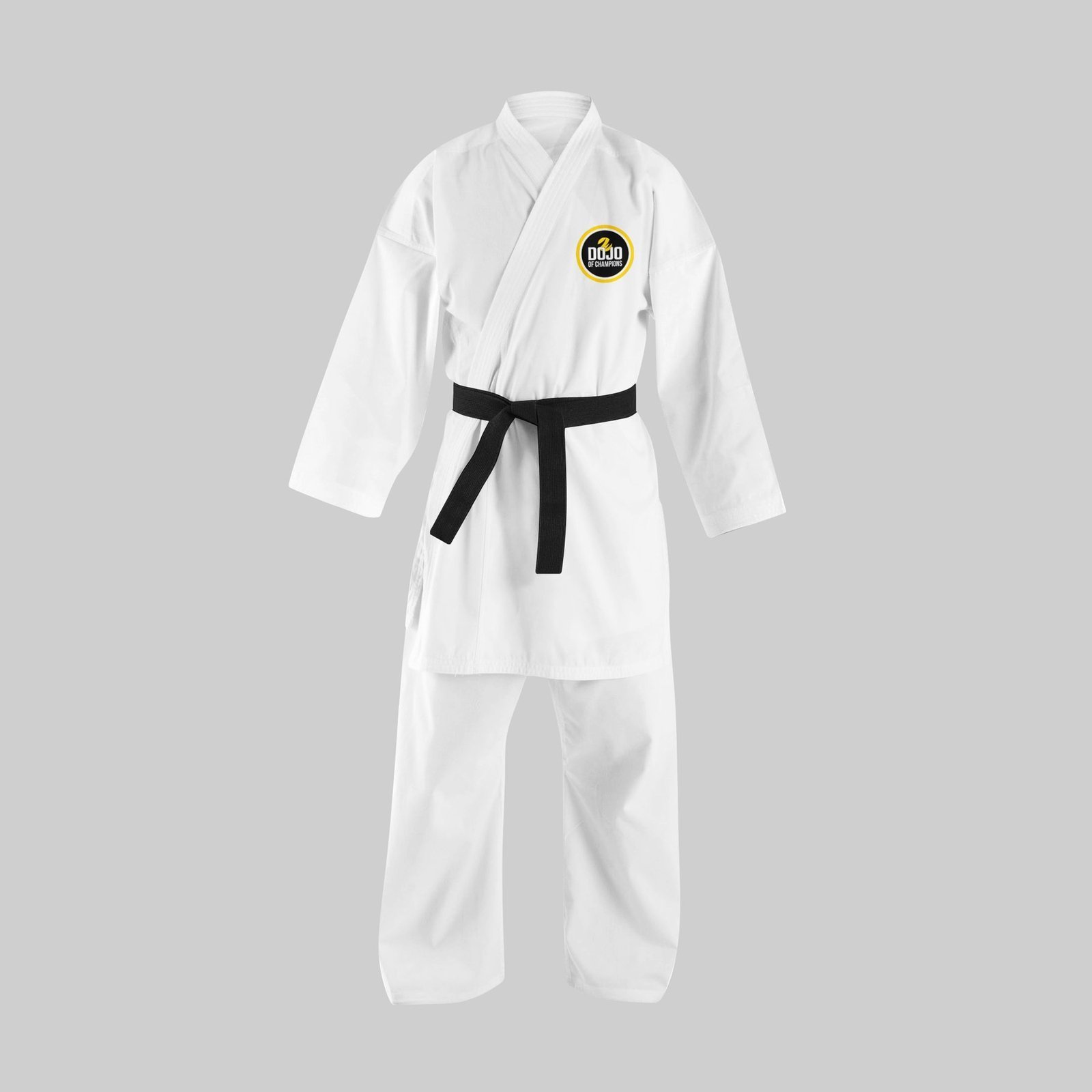
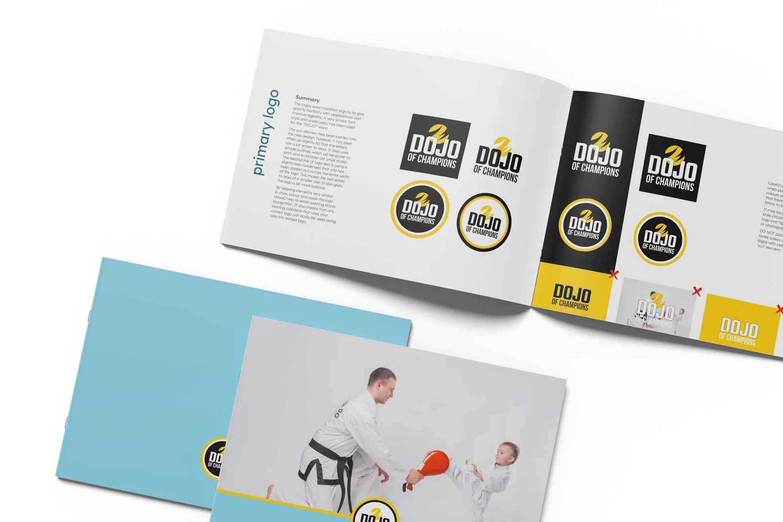
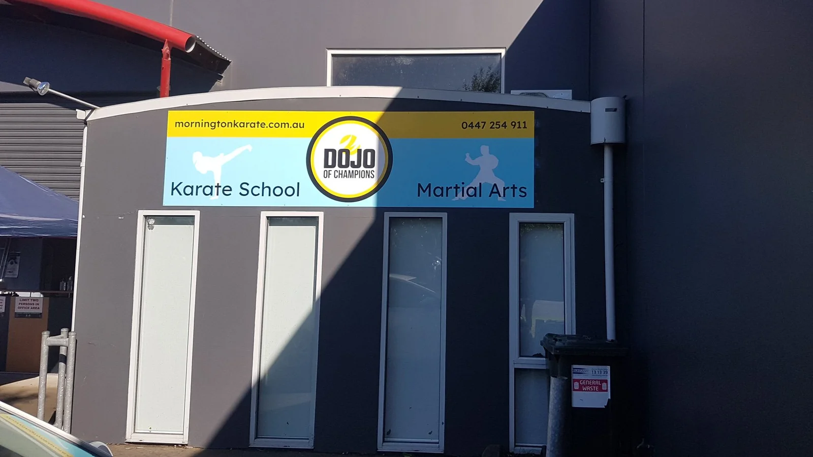
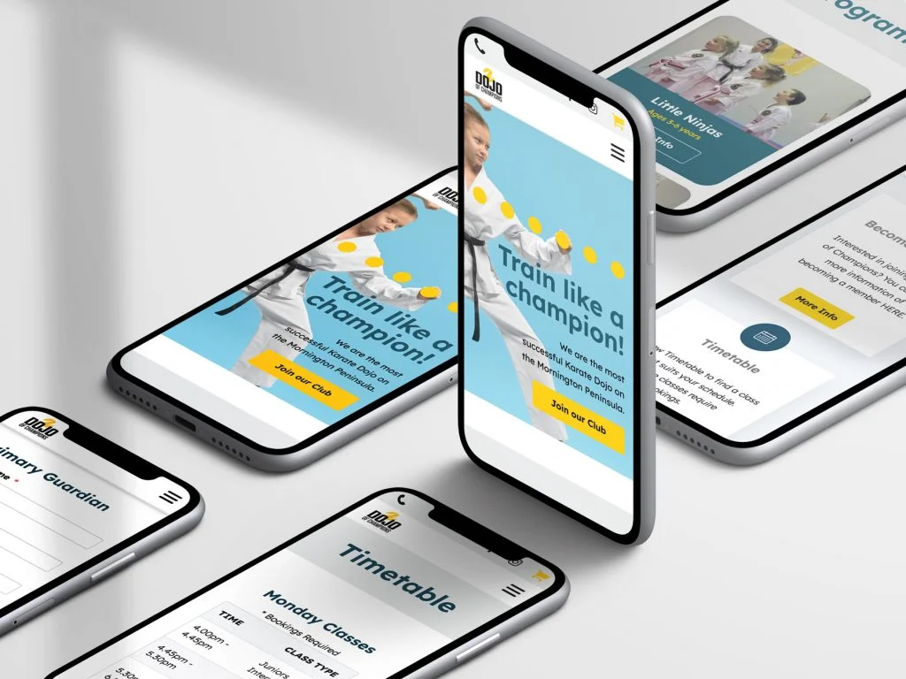
‘Peter Hollowood Martial Arts’ required a formal rebrand to ‘Dojo of Champions’. The new brand needed to remain recognisable while simultaneously being perceived as a family-oriented club, despite its high-level athlete achievements. A new website was required to serve as a digital hub for program research, timetables, and membership payments.
Key Stakeholders/Audiences: This branding solution needed to resonate with:
-
- Parents (members and non-members)
- Students (children and teenagers)

My role
As the sole designer and developer, my role covered the entire project life cycle: strategic brand development, design execution, and front-end development.
- Brand Strategy: Formalised a brand strategy to cover web, digital, and print, ensuring the new identity appealed to both the ‘champion’ aspiration and the ‘family-oriented’ requirement.
- User Research and Strategy: Conducted survey-based research with existing members and developed a content strategy to improve enrolment and streamline communications with students and parents.
- Digital Hub Design: Designed the new website to be the central hub for key transactions (paying memberships, booking classes, viewing timetables).
- Client Empowerment: Created reusable templates for member certificates and timetables, enabling the client to manage these processes independently post-launch.
Outcomes
The rebrand successfully transitioned the business while maintaining recognisability and achieving the goal of appealing to a family demographic.
- The new brand identity and website design achieved a balance between promoting high-level achievement (Champions) and a welcoming, family-friendly environment.
- The website became a successful transactional hub, centralising functions like class research, timetables, and membership payments.
- The creation of reusable templates directly contributed to improved operational efficiency by empowering the client to self-manage key administrative materials.
Success criteria
Successful formalisation of a brand strategy and delivery of a new website that streamlined enrolment processes and communications. The focus on reusable assets (templates) provided a quantifiable measure of operational independence for the client.
Reflections
While survey-based research was undertaken, given the dual audience of parents and students, I would have integrated user testing with the student demographic (children/teenagers) earlier in the design process. This would validate that the way-finding and visual language for program research were engaging and easily understood by the younger users, not just by their parents/guardians.