My role
As a key partner (Senior Digital Designer/Consultant) on this project, my role was strategic and focused on translating the organisation’s values and expertise into a high-fidelity visual and digital system.
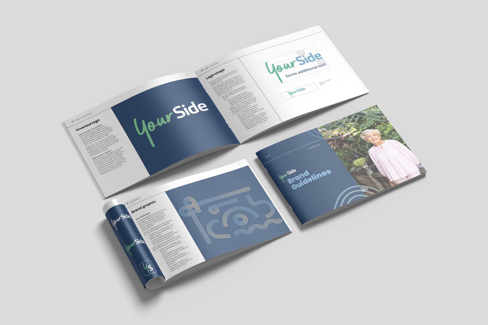
- Strategic Brand Governance: I led the initiative to create a comprehensive Brand Guidelines document. This was a critical intervention to address and eliminate the existing brand inconsistency, formalising rules on logo usage, clear space, typography, and colour palettes to ensure consistency across all touch points.
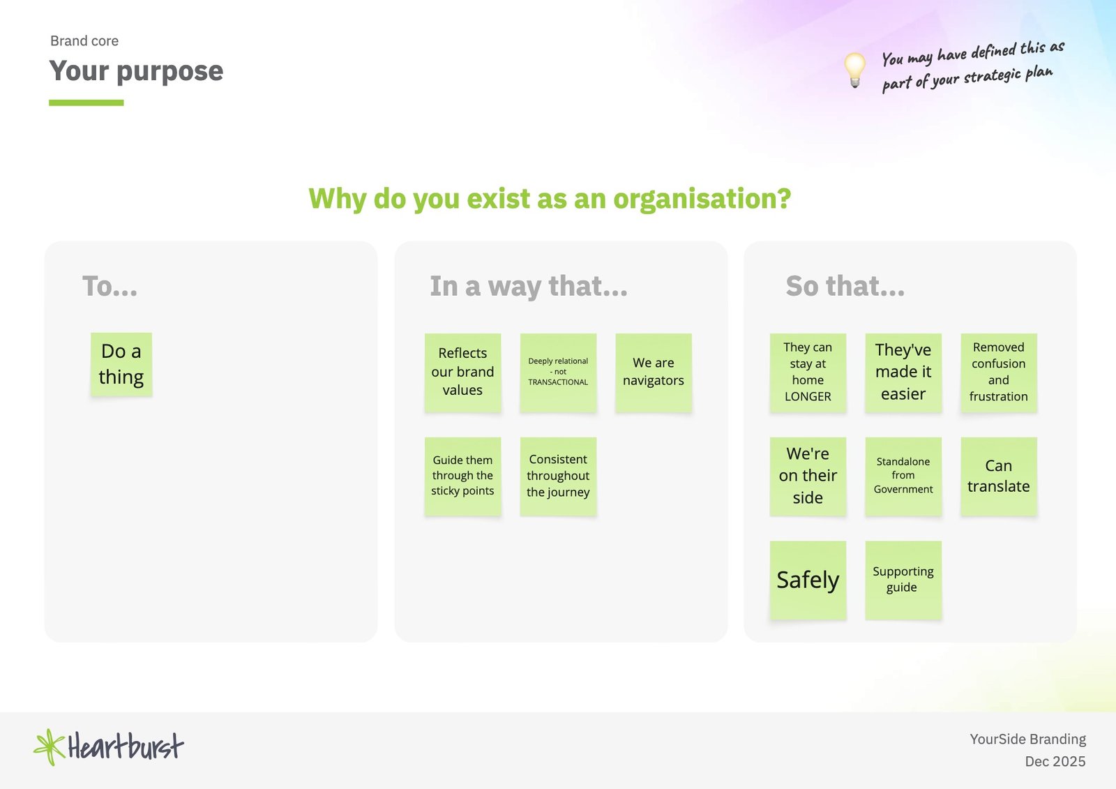
- Strategic & Audience Alignment: I facilitated the branding workshop to define the brand’s core, positioning, and persona, ensuring the final brand reflected the desired balance of professional authority and human-centred, cheeky spirit where appropriate.
- Logo and Typography Governance: I defined the logo anatomy, representing a partnership through the union of the lively, personal ‘Your’ (Miller font) and the bold, stable ‘Side’ (Carnas font). I created explicit rules defining minimum size, clear space (using the height of the lowercase ‘e’ as the unit of measure), and what to avoid to ensure legibility and impact.
- Visual Brand Extension: I conceptualised and formalised a custom graphic extension – The Pathways – derived from the concept of channels to represent Your Side’s supportive guidance and connection throughout the client journey.
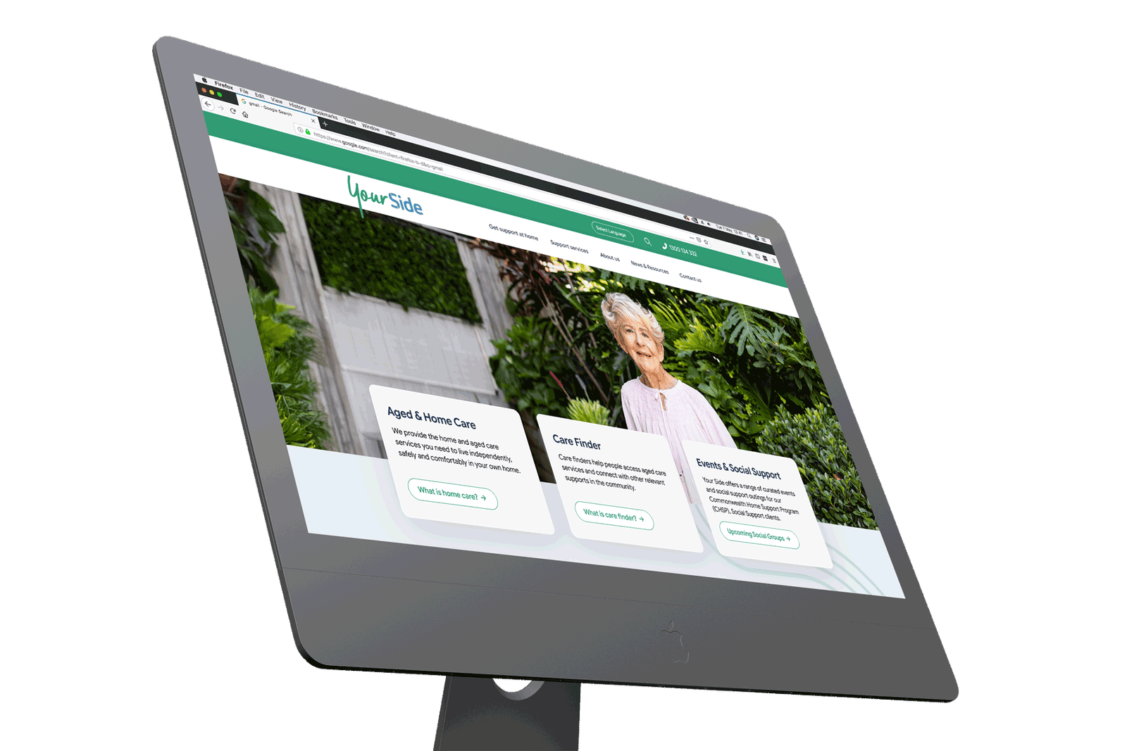
- Website Design (UX/UI): I defined the core website styles, including the pill-shaped button style, font hierarchy (Poppins for headings, Google Sans Flex for body copy), and a WCAG-compliant colour palette to ensure maximum accessibility and contrast.


The Brief
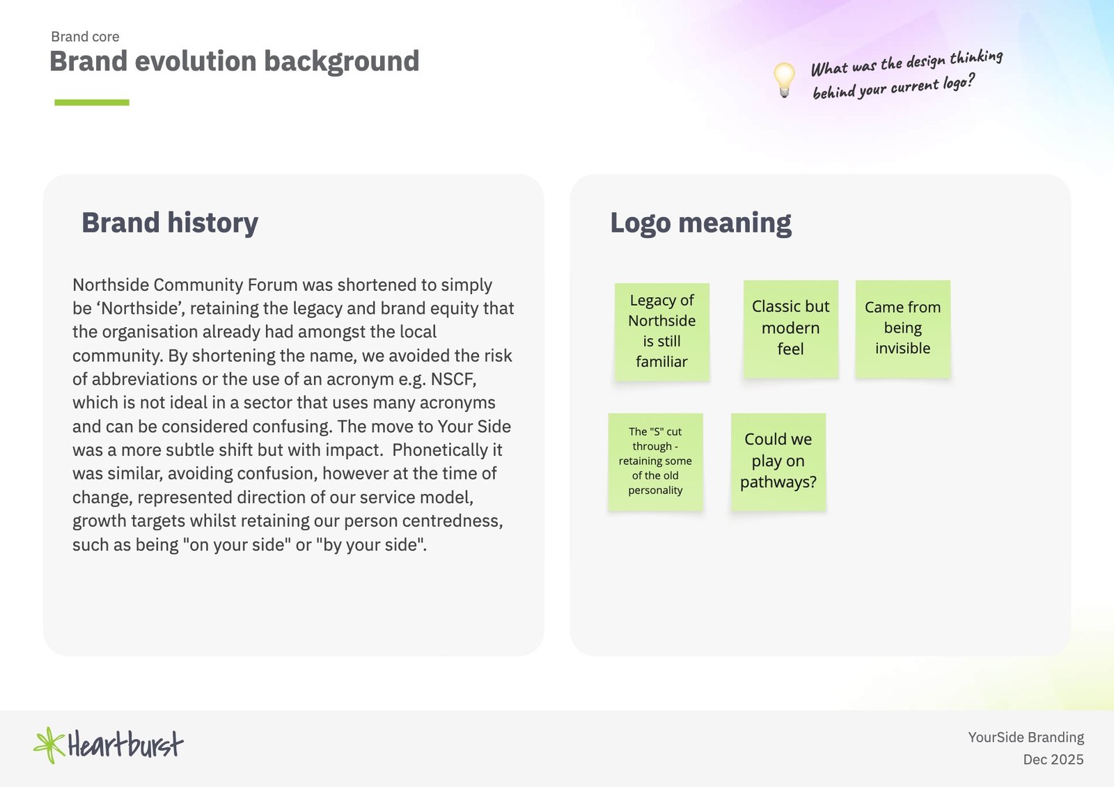
The core brief was to rejuvenate and formalise the Your Side brand to better align with its role as an established leader and navigator in the aged care sector. A key underlying driver was the need to combat the inconsistency and dilution of brand value resulting from the lack of a formal style guide and varied application of the existing identity. The formalisation aimed to ensure the brand reflected the organisation’s deep commitment to being deeply relational and a supporting guide for clients and their families.
The project’s output included a comprehensive visual style guide with a custom graphic extension and a high-contrast website home page concept.
Key Stakeholders/Audiences:
- Older Person Recipients: The primary user of the care services.
- Family/Carer/Partner (Mature Demographic): Existing clients who rely on Your Side’s services.
- Family/Carer/Adult Children (Younger Demographic): Prospective clients and key contacts who are navigating the aged care system.
Referrers (e.g., GPs, Community Services): Professional partners who rely on Your Side’s expertise.
Outcomes
The brand refresh successfully provided a modern, accessible, and comprehensive visual identity and a clear digital strategy that effectively halts brand dilution and differentiates Your Side from its corporate competitors.
- Formalised Brand Governance: The new comprehensive Brand Guidelines deliver the required rules and assets to build a more recognisable brand consistently, preventing the use of low-contrast backgrounds, font changes, and distorted logo applications.
- Effective Supporting Graphic: The introduction of The Pathways brand graphic was a significant success, providing a versatile, approved graphic that clients and staff can consistently use to frame content, direct the eye, or create subtle background textures.
- Enhanced Brand Messaging: The new visual and verbal identity effectively communicates the brand’s key messages: Convenience (taking the frustration out of aged care), Quality (deep, personalised support), and Advocacy (representing community interests).


Success criteria
The key measure of success was the delivery of a cohesive, human-centred brand system that establishes strong brand governance to protect Your Side’s value and position as a knowledgeable navigator and trusted partner in a confusing, acronym-heavy sector. The new formalised identity successfully balances the required industry professionalism and authority with the desired brand personality of being caring and progressive.
Reflections
The project was executed under an unusually tight, client-requested timeline, which restricted the necessary time for thorough, sequential testing and design review stages. This acceleration of work, combined with limited time for practical application testing across various software and media, occasionally led to double handling and additional revisions as brand elements were tested in live applications.
Moving forward, I would advocate for mandated, formal design review stages with sufficient time allocated upfront. This longer timeline for practical testing and refinement is crucial to validate the brand elements across all applications (print, digital, social) before final sign-off, ensuring total compliance and preventing unnecessary revisions during the implementation phase.