The Brief
The core brief was to address pain points such as poor usability, untracked conversions, and fragmented processes managed via external URLs, to deliver a modern, user-centric platform that strengthened the MFAA’s “Trusted Voice”.
Key Stakeholders: The MFAA Executive and Membership Teams, whose strategic pillars included Advocacy, Professional Standards, and Innovative Solutions.
My role
As a Senior Digital Designer, my role was critical in ensuring the design translated complex regulatory needs into a streamlined experience.
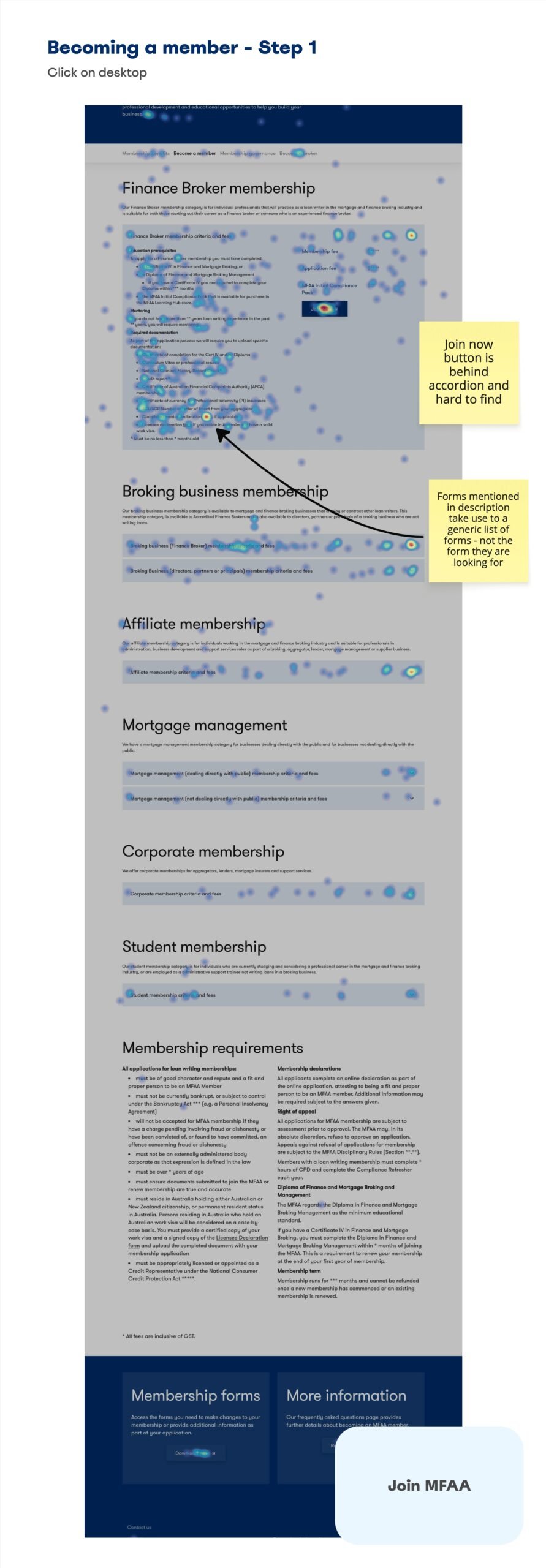
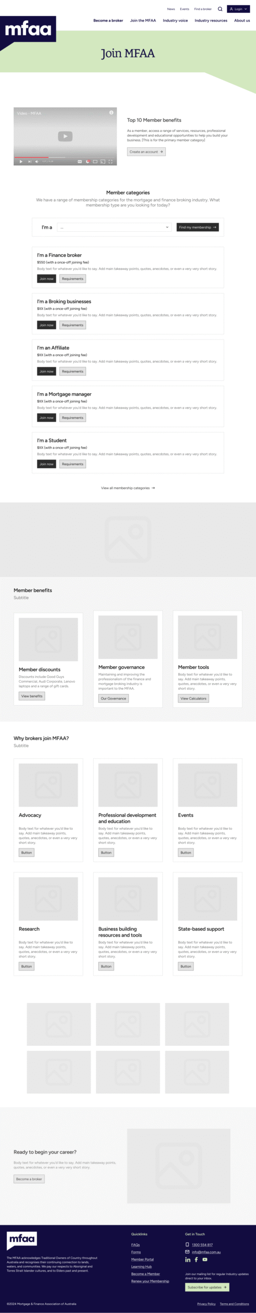
- Strategic Discovery: Led desktop research, persona analysis, and benchmarking, which identified key pain points (e.g., confusing “Join Now” flows and offsite event management) that shaped the final information architecture and user stories.
- Stakeholder & Technical Bridge: Collaborated closely with a third-party branding agency and solution consultants to align the new brand identity with the technical flowcharts, ensuring a cohesive experience and seamless handoff to external systems (LMS, Member Portal) despite systemic constraints.
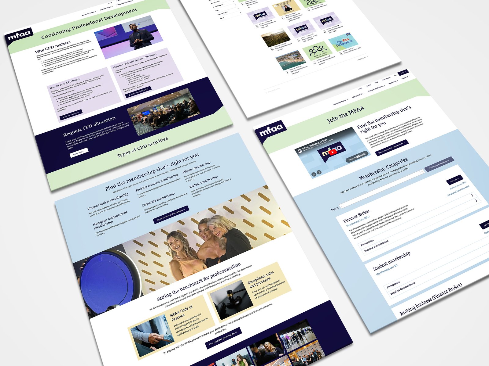
- Creative Execution: Developed clear visual hierarchies, comparison charts for membership differentiation, and advanced event filtering capabilities to directly address usability test findings.
Outcomes
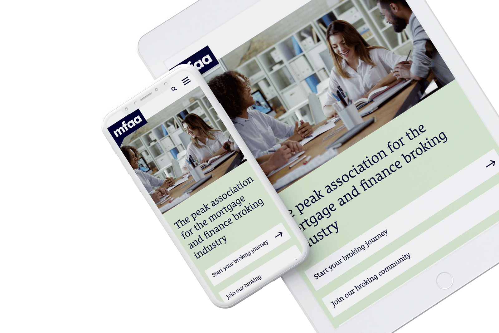
The redesign successfully achieved full compliance with contemporary digital governance standards and delivered a modern, brand-aligned interface that significantly streamlined the member onboarding process.
- Streamlined Onboarding: The design significantly streamlined the member onboarding process.
- Seamless Transitions: I designed consistent UI patterns and directional cues for the necessary seamless system transitions to external platforms (LMS, payment gateways). This focused the solution on reducing user friction and maintaining data collection continuity, despite the technical fragmentation.
Success criteria
Designing consistent UI patterns and directional cues for the necessary seamless system transitions to external platforms (LMS, payment gateways). This focused the solution on reducing user friction and maintaining data collection continuity, despite the technical fragmentation.
Reflections
The project highlighted the challenge of scope boundaries imposed by existing client systems. I learned to negotiate more effectively in the Discovery Phase to integrate critical functionalities directly on-site, rather than relying on optimised offsite redirects. This experience strengthened my ability to push back on technical debt in favour of long-term user experience gain.